

How are Desis pro at Data Visualization?
How are Desis pro at Data Visualization?
Sandal Designer from Sindh proves it!

If you are following the emails every Monday
You can clearly see how we are scaling your Data Analysis concepts from basic to advanced.

I discussed baby visualization techniques in this email
And now I am going to talk about some dope level advanced visualization techniques.
Believe you me, with these techniques you can make anything look visually appealing
Take some classes from this Sandal Designer, mayn! Respect

No more boring visuals, charts, and confusing scatter plots!
With advanced data visualization techniques, you'll be able to create stunning visualizations that not only look amazing but also convey complex information in a clear and concise way.
It's time to step up your game and create visualizations that truly stand out.
So, what can you expect to learn with our advanced data visualization techniques?
We'll cover everything from interactive visualizations that let your audience explore the data on their own, to advanced chart types like heat maps that can help you showcase complex relationships between data points.
So, without further ado, let's dive into some advanced data visualization techniques!
1. Interactive Dashboards

Zamana badal gaya hai saheb!
Gone are the days where you could impress your boss with static charts and graphs.
Today's data visualizations are all about interactivity, allowing users to explore and manipulate data in real-time.
Interactive dashboards are one of the most powerful tools in this space, allowing you to combine multiple charts, graphs, and other visualizations into a single interface that users can control.
For example, imagine a sales dashboard that shows key metrics such as revenue, profit, and customer retention.
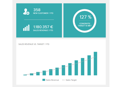
All you need to do is select the time period, location product category, and other variables from the filters to give more and more specified result of the data so you can make informed decisions!
You can also drill down into individual data points to see the underlying details.
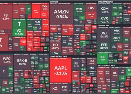
2. Heat Maps
If only we could actually test people in our lives with these Heat Maps, I would first get rid of all the Red Flags!
Eghh but this doesn’t exactly do that, it shows the intensity of a particular variable across a set of data points.

Think of it like a color-coded treasure map, with the colors indicating the temperature, stock performance, or any other variable you want to measure.
Red means hot and green means cool, just like your favorite chutney!
For example, a weather app might use a heat map to show the temperature across a region, with hotter colors indicating warmer temperatures and cooler colors indicating cooler temperatures.
Similarly, a stock market app might use a heat map to show which stocks are performing well (represented in green) and which are performing poorly (represented in red). Here is an example, you can continue your stock picking after evaluating these!
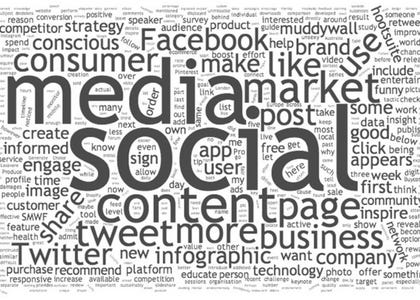
Word Clouds
Who says data visualizations have to be all charts and graphs?
Word clouds are a fun and visually appealing way to represent text data.
They use size and color to represent the frequency of words in a given text.

For example, a word cloud of a company's social media mentions might show that the most common words used by customers are "content page," "consumer," and "market"
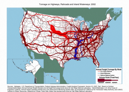
Sankey Diagrams
Sankey diagrams are a powerful way to visualize flow and movement within a system.
They use a series of arrows to represent the movement of a variable between different states or categories.
For example, a Sankey diagram could be used to show the flow of traffic through a city's road network, with thicker arrows representing more traffic.
Well, that's all for now!
We hope you enjoyed this journey through the world of advanced data visualization.
Remember, when it comes to data, seeing is believing - and with these techniques in your toolkit, you'll be a data wizard in no time!
So go forth and create beautiful, interactive dashboards that would make even the most data-averse person say "Wow, that's cool!".
And don't forget to keep exploring and experimenting with different visualization techniques - who knows what kind of insights you'll uncover!
Until next time, keep visualizing and stay curious!
Hafsa and Zain from Team Inspired Analyst - signing off!