

Basics of Data Storytelling
Basics of Data Storytelling
Turning Numbers into Narratives

Whether you're a data analyst or simply someone interested in making sense of data, we're excited to have you here.
Do you ever feel like your data is just a bunch of numbers and charts that no one wants to look at?

As a data analyst, I know the feeling.
But what if I told you that with a little storytelling magic, you could turn those numbers and charts into something that people actually want to read and act on?
That's the power of data storytelling.

In this newsletter, we'll explore how you can use storytelling techniques to bring your data to life, engage your audience, and make an impact.
So grab a cup of chai and let's get started!
Why Storytelling Matters in Data Analysis
When we think about data analysis,
we often think of numbers, graphs, and charts.
But at the end of the day, data is only useful if we can make sense of it and use it to drive action.
That's where storytelling comes in.
Storytelling helps us turn data into something more than just a collection of numbers - it turns it into a narrative that people can relate to and understand.
A well-crafted story can help people see the "big picture" of what the data is telling us and inspire action.
The Elements of a Compelling Data Story
Now that we know why storytelling matters in data analysis, let's talk about how to tell a compelling data story.
Here are the key elements to keep in mind:
1. Start with a Hook
Just like any good story,
you need to catch the attention of the audience,
The first is to make demands and expect the audience to pretend to be interested, similar to the way this person is behaving.:

Alternatively, you can capture people's genuine attention by beginning with an engaging hook and making the information more interesting overall.
This could be a surprising statistic, an interesting fact, or even a provocative question.
Good Example: "Did you know that the average person spends over two hours a day on social media?"
Bad Example: "According to recent studies, social media usage has increased over the past decade."
The good example is more attention-grabbing because it starts with a specific and surprising fact.
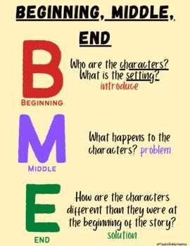
2. Create a Narrative Arc
A compelling data story should have a clear narrative arc, just like any other story.
This means it should have a beginning, middle, and end, with a clear progression from one to the other.
Good Example: "At the beginning of the year, our company was struggling to retain customers. But by implementing a new customer loyalty program, we were able to increase retention rates by 25%."
Bad Example: "Our company's retention rates have increased by 25%."
The good example has a clear narrative arc that follows a problem-solution format, while the bad example is more of a simple statement of fact.
3. Use Visualizations to Support the Story
Visualizations are a key part of any data story because they help support the narrative and make the data more understandable.
Do you prefer listening to someone recounting how their heart rate changed during the day they proposed to their partner,
or would you rather simply observe a stunning visualization that demonstrates this information?

But using the right visualizations for the data you're presenting is important.
Good Example: "As you can see from this line graph, our sales have steadily increased over the past year, with a noticeable bump after we launched our new marketing campaign."
Bad Example: "Here's a graph that shows our sales data for the past year."
The good example uses a specific type of visualization to support the story and make the data more understandable, while the bad example is more generic and doesn't add much value.
4. Make it Personal and Engaging
Finally, a compelling data story should be personal and engaging, with a clear voice and tone that draws the reader in.
This means avoiding technical jargon and using language that anyone can understand.
Good Example: "When we saw that our customer satisfaction rates were dropping, we knew we had to take action. By listening to our customers and making changes based on their feedback, we were able to turn things around and increase satisfaction by 30%."
Bad Example: "We were able to increase customer satisfaction by 30% by implementing changes based on feedback."
The good example is more engaging because it uses a personal voice and talks about specific actions taken, while the bad example is more impersonal and dry.
Make it personal and below will be the scenes at the end of your story.

Conclusion
So there you have it - the key elements of a compelling data story.
As an analyst myself, I know firsthand the importance of data storytelling.
I use it every day to communicate complex data and insights to our clients and internal teams.
But data storytelling isn't just for analysts - it's for anyone who wants to make data more meaningful and actionable.
So the next time you're presenting data, think about how you can turn it into a compelling story.
Use the tips and examples we've discussed in this newsletter,
and don't be afraid to get creative!
For now,
Zain from Team Inspired Analyst - signing off!
آپ وہ پہلی شخصیت ہیں جن کو دیکھ کر میں نے ڈیٹا اینالسٹ فیلڈ چونی ہے۔
الحمدللہ میرا اب تک کا بہت اچھا تجربہ رہا ہے۔
اللّٰہ تعالٰی آپ کو عزتوں سے نوازے آمین 🤲💕
It was really worth it, sir. Honestly sir, I am feeling too good to know that I discovered you somehow.
Thank you so much for every single information you provide. Allah pak apko hmesha khush rkhy or apko apni bimarion se lrne ki himmat de❤️